
TSMC-Online • Design System
I was responsible for organizing the handoff to the client and ensuring the design system's readability and ease of understanding.
Role
Product Designer
Team
2 Designers
Timeline
2 months
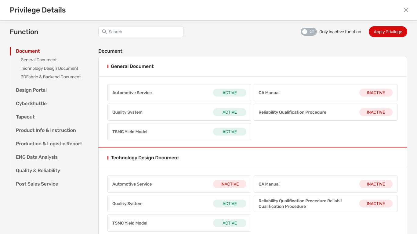
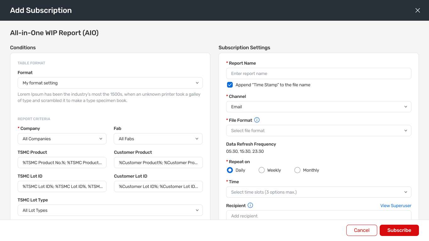
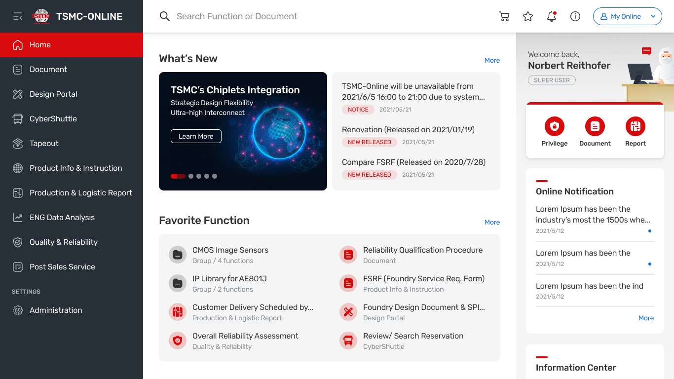
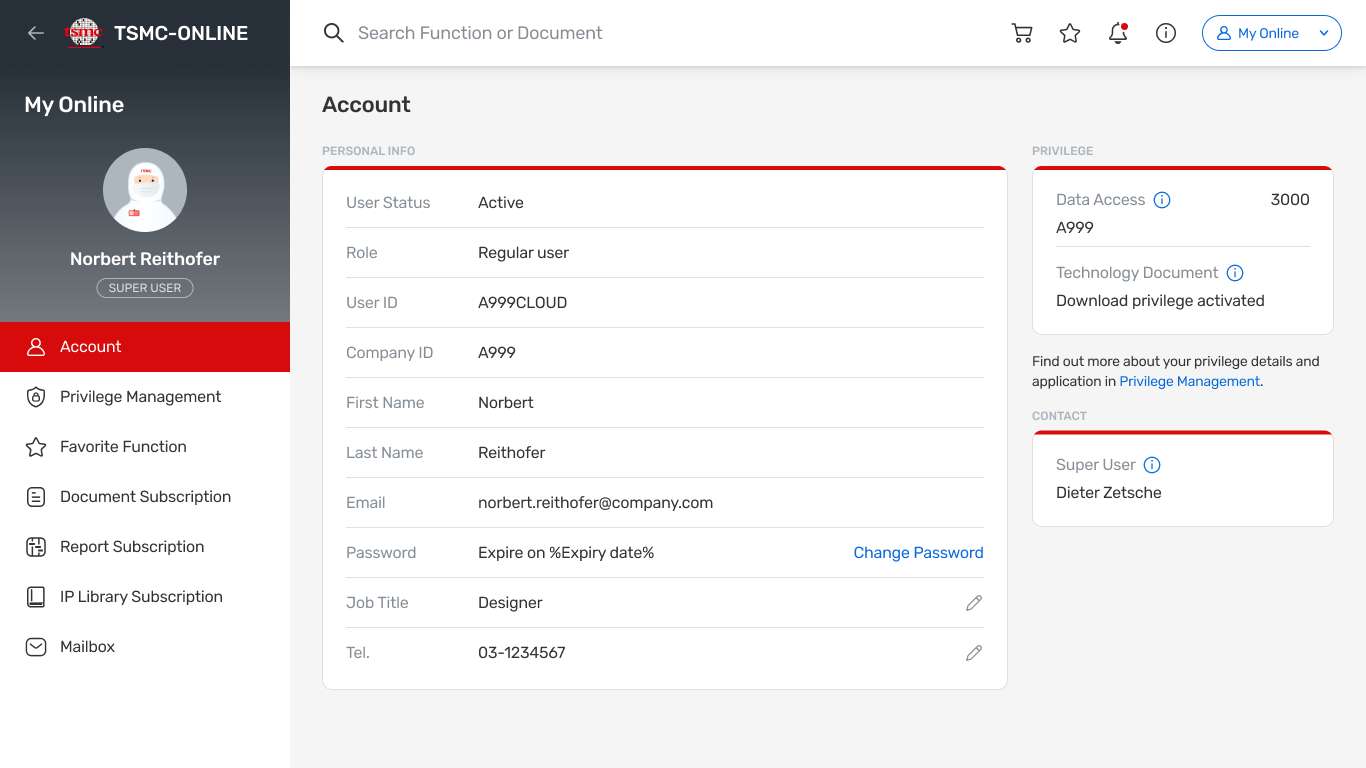
TSMC didn't have a solid design team, so we wanted to ensure that all components remained consistent in terms of usage and behavior. After the handoff, if the customer service team wants to launch a new feature, they can base the new flow on the design system.
Outcome
We delivered all our components through Figma and handed them off to the customer service team at the end.


Messages
Platform
Actions
Status
Guide
Dark
Dark Grey
Hint
declined
Link
System Dark Navy
Guidance
Negative
Red
System Error
Error/ Warning
System Red
Inactive/ Warning
System Red
Primary
System Red
Theme
Caution
Yellow
System Yellow
Notice
declined
declined
Progress
blocked
Beige
declined
System Beige
Partially Active
System Orange
Function action
declined
Positive
Green
System Green
Success
System Green
Active
declined
declined
Informative
Blue
System Blue
Information
System Blue
In Progress
System Blue
Secondary
System Blue
Link
Inactive
Gray
declined
declined
Disabled Solid
Disabled
Section BG
Background
Theme Color
These are the main branding colors & color themes of TSMC-Online platform, the main visual presence.
AA
System Red
#D70B0B
AAA
System Dark Navy
#273038
AA
System Blue
#096ADB
AAA
Section BG
#F5F5F5
Neutral Color
AAA
White
#FFFFFF
AAA
Section BG
#F5F5F5
AAA
Light BG Small
#F5F7F7
AAA
Light BG
#F0F2F2
AAA
Light Stroke
#E0E1E3
AA
Light Blue Gray
#ADB5BD
AA
Medium Blue Gray
#868E96
AA
Medium Gray
#666666
AAA
Dark Gray
#333333
AAA
System Dark Navy
#273038
AA
Disabled Text
#AAAAAA
AA
Disabled Stroke
#CCCCCC
AA
Disabled Solid
#DDDDDD
System Color
These are the color palettes that are being used systematically throughout the platform.
AA
Tint Red
#FBE7E7
AA
AA
Light Red
#FACCCC
AA
Bright Red
#E40202
AA
System Red
#D70B0B
AA
Dark Red
#C71D22
AA
AA
Light Error
#FCEAEA
AA
System Error
#E42929
AA
AA
Light Blue
#E6F0FB
AA
System Blue
#096ADB
AAA
Dark Blue
#0755AF
AA
Light Green
#E5F3EE
AA
System Green
#00875A
AA
Light Beige
#F6F0E6
AA
System Beige
#A96806
AAA
System Yellow
#FFDC62
AA
System Orange
#F2A000
Headline
Headline 1
Font
Rubik
Weight
Medium 500
Size
24pt
Line Height
30px
Letter Spacing
-0.2px
I’m a header’s title
Full Page Modal
The Headline 1 is mostly used for full page modal’s header title.
Headline 2
Font
Rubik
Weight
Medium 500
Size
22pt
Line Height
24px
Letter Spacing
-0.2px
I’m a page’s title
Home
Search Result
Level 3 Function Page
Headline 3
Font
Rubik
Weight
Medium 500
Size
20pt
Line Height
24px
Letter Spacing
-0.2px
I’m a modal’s title
Modal
Button
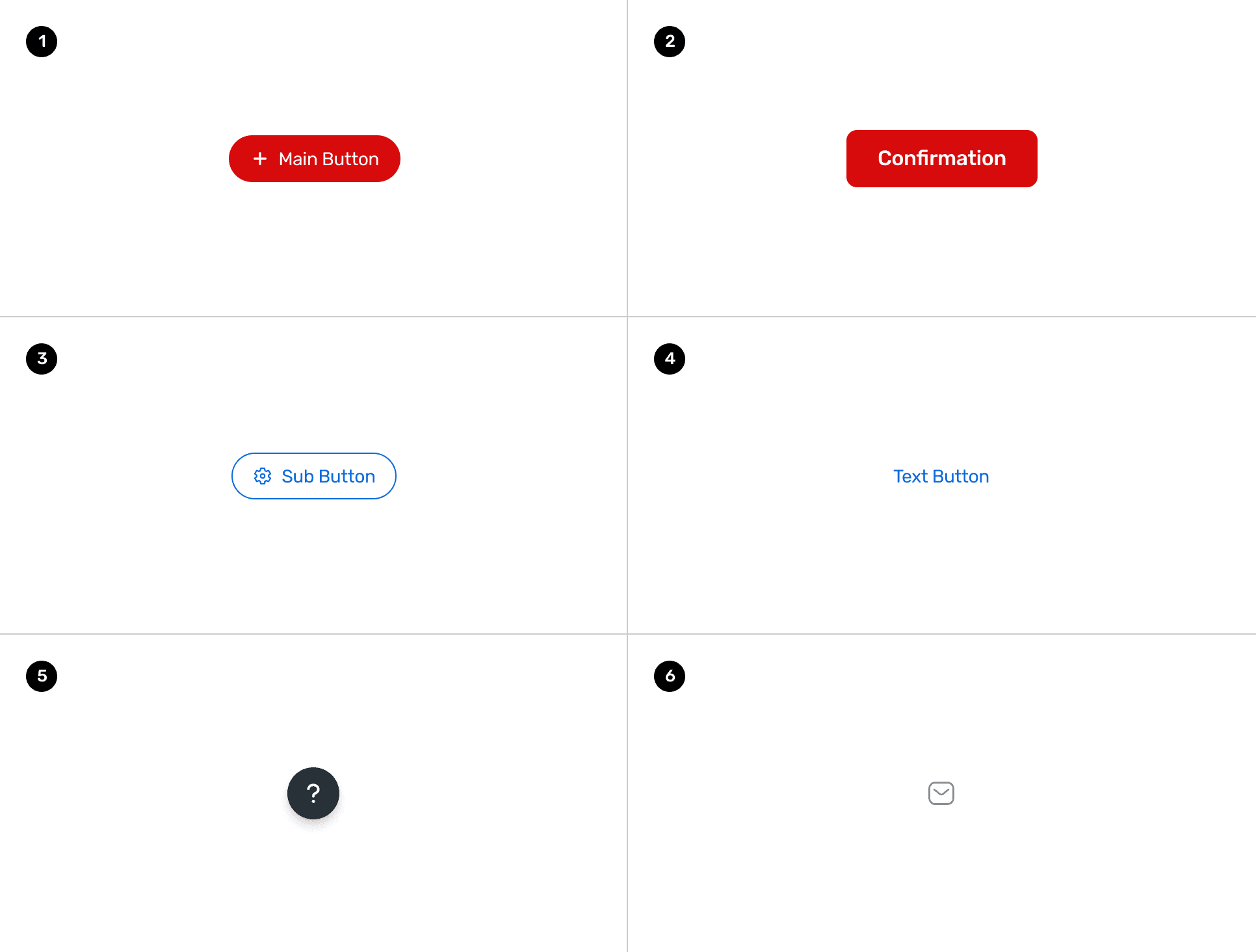
Based on the function and purpose, button can be defined in several types:
1. Main Button
Main Button represents the most important action in that page.
2. Main Button: Confirmation
Main Confirmation Button is used when that page have the event need to be confirmed.
3. Sub Button
Sub Button represents the sub action in that page.
4. Text button
Text button represents the less important action in that page.
5. Floating Action Button (FAB)
Floating Action Button performs the most important or common action on the page, it allows the user access the button easily.
6. Image Button
Image button represents the less important action. Compare with Text button, transforming the content to the visualization.
Button
Hierarchy: Main Button
The Main Buttons can be defined in 2 hierarchys: Primary and Secondary
A
B
Main Button
1
Main Button
A
B
2
Confirmation
Confirmation
1. Main Button
A. Primary (High emphasis)
B. Secondary (Medium emphasis)
2. Main Button: Confirmation
A. Primary (High emphasis)
B. Secondary (Medium emphasis)
Hierarchy Guideline
All buttons in TSMC-Online platform can be defined into different levels of emphasis from most-emphasis to low-emphasis.
Text Button
Medium-emphasis
Low-emphasis
Most-emphasis
Floating action button
Main Button - Primary
Main Button - Secondary
Text button, Image button
High-emphasis
Main Button
Confirmation
Main Button
Confirmation
1. The FAB (floating action button) will be shown at every pages in TSMC-Online.
Using FAB to trigger the “Help” feature in TSMC-Online, the button will at the highest layer in the page. User can easy to access the button as they want
2. Keep only ONE Main Button in the page
Without regard to the FAB logic, keep one main button in that page. Let the user can focus on the most important task which the Main Button will be expressed. Such as "Login", "Download", "Create" or "Confirm"...etc.
3. If the page have multiple buttons scenario
Try to use one Main Button (most important task) with other medium and low emphasis buttons (less importent tasks). Also consider the button appearance and placement to let the UI is clear and easy-to-use.
Search Function or Document
My Online
Submit
Clear
Cancel
Button
Default
Hover
Pressed
Disabled
Medium+Icon
Medium+Dropdown
Medium
Small
Small+Icon
Introduction
Introduction
Introduction
Introduction
Create Group
Create Group
Create Group
Create Group
Manage
Manage
Manage
Introduction
Introduction
Introduction
Introduction
Introduction
Manage
Download
Download
Download
Download
Medium
Medium+Icon
Small
Small+Icon
Create Group
Create Group
Create Group
Create Group
Add to DocCart
Add to DocCart
Button
Add to DocCart
Add to DocCart
Button
Button
Button
Button
Button
Button
Button
Default
Hover
Pressed
Disabled
Toast
1. Successful
Main Button represents the most important action in that page.
2. Informative
Main Confirmation Button is used when that page have the event need to be confirmed.
3. Failed
Main Confirmation Button is used when that page have the event need to be confirmed.
1
Successful feedback
2
Informative feedback
Failed feedback
3
Status
Based on the status, toast can be defined in several types:
1. Text
Providing contextual feedback.
2. Text and Button
Providing contextual feedback with related action button.
Failed feedback
1
Failed feedback
Button
2
Purpose
Based on the purpose, toast can be defined in several types:
Composition
Failed feedback
Button
A
B
C
D
A. Icon
B. Content
C. Action Button (optional)
D. Close Button
Content Guideline
Please select at least one item.
Lorem ipsum dolor sit amet, consectetur adipisi elit, sed do eiusmod tempor
Keep the content clear, short and easy to unserstand
Suggested character limitation of the Link: 80 characters
Changes saved.
Documents unsubsribed.
Using past simple tense.
“Job Title” updated.
“Tapeout Dashboard” moved to “Do Not Display”.
Using medium font size and “quatation mark” to emphasize certain text.